# Introduction
This client side API is available after you correctly integrated the moinAI Chat Widget into your website.
Keep in mind: The examples here are purposefully written in ES5 Javascript syntax to be fully compatible for Google Tag Manager integration. Feel free to use ES6 if you dont use GTM and like to do so.
# Getting Started
If you wish to start manipulating the widget with the API right away you will have to register a chatWidgetReadyfunction in the global window object. This function is called by the moinAI Chat Widget after successfull initiation and after making sure everything works.
window.chatWidgetReady = function() {

  /* the moinAI Chat Widget will call this function
  * upon bootstrapping itself and having full interoperability
  * place your code in here
  */

}
❗️❗️ Attention: keep in mind that a second registering of this function will overwrite the function before it. You have to consolidate your API functions here and/or make sure your usage of the API is clearly happening while the site and widget are expected to be interoperable. ❗️ ❗️
# Namespace
The Client Side API lives in the window.moinnamespace in your DOM and is exposed by the widget upon successfull bootstrap. The old namespace was window.knwophere.apiand is deprecated. It still works to be backwards compatible but will be EOL 1.11.2025.
# Methods
# open()
# Arguments
none
# Usage
Open the Widget. Does nothing if already open.
window.moin.open()
# close()
# Arguments
none
# Usage
Close the Widget. Does nothing if already closed.
window.moin.close()
# toggle()
# Arguments
none
# Usage
Toggle the Widget open state. Open->Close ; Close->Open
window.moin.toggle()
# startWith({ text, intent })
# Arguments
# text
- Type:
string - Optional
A user message to start the conversation with. The text is sent as if the user had typed it into the input bar — it appears in the chat as the first user message.
# intent
- Type:
{ name: string, parameters?: { confidence?: number } } - Optional
An intent to start the conversation with. name is the intent identifier. parameters.confidence defaults to 1.
At least one of text or intent must be provided. They can also be combined — in that case the text is shown as the user message and the intent steers the conversation flow.
# Returns
A Promise that resolves to either { ok: true } or { ok: false, message: string, error: Error }.
The call is rejected (ok: false) when:
- Neither
textnorintentis provided. textis sent while the bot has text input disabled by configuration (disabled) or is currently expecting a button-only response (cancel).
# Usage
startWith() opens the widget and submits the given text and/or intent as the first message of the conversation. Unlike calling open() followed by sendIntent(), it does not trigger the default welcome — the text/intent is the first thing in the conversation.
Only call this when the widget is closed. If the widget is already open, use sendIntent() instead.
Start with an intent:
window.moin.startWith({
  intent: { name: 'order_return', parameters: { confidence: 1 } }
})
Start with a user text message:
window.moin.startWith({ text: 'Wie kündige ich mein Abo?' })
Start with both — the text is shown as the user's first message, the intent drives the flow:
window.moin.startWith({
  text: 'Ich möchte mein Formular fortsetzen',
  intent: { name: 'form_continue', parameters: { confidence: 1 } }
})
Handle the result:
const result = await window.moin.startWith({ text: 'Hallo' })
if (!result.ok) {
  console.warn('startWith rejected:', result.message)
}
Calling startWith() without any arguments behaves the same as open().
# Example: launching the widget from your own input bar
A common pattern is to place your own input field (for example a hero search bar) on your landing page and forward the user's text into the widget when they submit. Pair the text with a fallback intent so the bot routes the question to a sensible agent even when the input is vague:
Your hero form on the page:
<form id="hero-ask">
  <input id="hero-ask-input" placeholder="Wie können wir helfen?" />
  <button type="submit">Frage stellen</button>
</form>
The handler that forwards the input into the widget:
document.getElementById('hero-ask').addEventListener('submit', async (event) => {
  event.preventDefault();
  const text = document.getElementById('hero-ask-input').value.trim();
  if (!text) return;

  const result = await window.moin.startWith({
    text,
    intent: {
      name: 'faq_general_faq_topic',
      parameters: { confidence: 1 },
    },
  });

  if (!result.ok) {
    console.warn('Could not start conversation:', result.message);
  }
});
The user sees their typed question as the first message in the chat, the widget opens, and the bot starts in the faq_general_faq_topic agent.
# teaser({options})
❗️❗️ Attention: Only use this if you know what you are doing. The Hub has a full "Teaser Management" section which includes advanced ordering/filtering of which teaser to send to which audience and has the appropriate stats if used. Only use manual teasers if your usecase is specifically NOT covered by the existing interface. ❗️❗️
# Arguments
# showTeaser
- Type:
Boolean - Default:
true
# showAvatar
- Type:
Boolean - Default:
true
# message
- Type:
string - Default:
''
# quickActions
- Type:
Array - Default:
[]
Expects quickActions Objects like:
{
  text: 'quickActionText',
  intent: 'intent_identifier_1'
}
# banner
- Type:
Object - Optional
A promotional banner shown above the inline input bar with a gradient background and up to several call-to-action buttons. Only takes effect when the bot is configured for inline-inputbar mode. In the classic teaser mode the banner field is ignored.
Fields:
text—String, required. The banner copy.colors.from—String(hex), required. Gradient start color.colors.to—String(hex), required. Gradient end color.buttons—Array, required. One entry per CTA. The banner is rejected silently ifcolors.fromandcolors.toare not both set.
Each buttons[] entry:
label—String, required. Button text.url—String, required. Link target.style—'primary' | 'secondary' | 'link', optional.
# Usage
Open teaser without Avatar and without quick actions
window.moin.teaser({
    showTeaser: true,
    showAvatar: false,
    message: 'Open the Widget? 🍄'
})
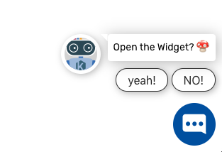
Open a teaser with quick actions and avatar
window.moin.teaser({
    showTeaser: true,
    showAvatar: true,
    message: 'Open the Widget?',
    quickActions: [
     {text: 'yeah!', intent: 'intent_identifier_1'},
     {text: 'NO!', intent: 'intent_identifier_2'}
    ]
})
Results in:
Open a teaser with an inline-inputbar banner (only effective when inline-inputbar mode is enabled):
window.moin.teaser({
    showAvatar: true,
    message: 'Wie kann ich dir helfen?',
    quickActions: [
      { text: 'Wie funktioniert eure KI?', intent: 'faq_general_faq_topic' },
      { text: 'Wie viel kostet ihr?',      intent: 'faq_pricing' },
      { text: 'Wo bekomme ich eine Demo?', intent: 'demo_request' },
    ],
    banner: {
      text: 'Entdecke unsere KI-Lösung',
      colors: { from: '#0075BF', to: '#005B93' },
      buttons: [
        { label: 'Demo buchen',  url: 'https://moin.ai/demo', style: 'primary' },
        { label: 'Mehr erfahren', url: 'https://moin.ai',     style: 'secondary' },
      ],
    },
})
*** Altenative, more compact Param description ***
{
  showTeaser: Boolean [Default: true], // display teaser
  showAvatar: Boolean [Default: true], // display the avatar
  message: String  [Default: '']// teaser message
  quickActions: Array [Default: []]// possible teaser quick actions
  banner: Object [Optional] // inline-inputbar promo banner; ignored outside inline-inputbar mode
}
Each teaser will overwrite the teaser before it.
# setTeaserVisibility(visible)
# Arguments
visible: Boolean. true shows the currently displayed teaser, false hides it.
# Usage
Temporarily override the visibility of the currently displayed teaser without removing it. This is useful when you need to hide the teaser so that users can interact with elements of your page that would otherwise be overlayed — for example, when the user scrolls near the bottom of the page and the teaser covers footer links. Calling it again with true makes the teaser re-appear.
Has no effect if there is no teaser currently configured.
window.moin.setTeaserVisibility(false) // hide the teaser
window.moin.setTeaserVisibility(true)  // show it again
# hideWidget()
# Arguments
none
# Usage
Hide the widget Bubble, Teaser and the Widget itself when it is showing. Does nothing if already hidden.
window.moin.hideWidget()
# showWidget()
# Arguments
none
# Usage
Show the widget again after a hideWidget call.
window.moin.showWidget()
# addContext({context})
# Arguments
context object
# Usage
Add context object to conversation. Only use this if you know what you are doing!
window.moin.addContext({context})

//Example
window.moin.addContext({user_email: "dev@moin.ai"});
# getContext()
# Arguments
context object
# Returns
[context]
# Usage
Get array of manually added context objects.
window.moin.getContext()
# setWidgetzIndex(index)
# Arguments
new z index value of the whole widget
# Usage
Set the zIndex of the widget for compatibility with other elements on the site.
window.moin.setWidgetzIndex(index)
# setPosition({ bottom, right, unit, force })
# Arguments
bottom: relative distance from the bottom of the viewport. Accepts numbers or strings.
right: relative distance from the right edge of the viewport. Accepts numbers or strings.
unit: optional CSS unit applied when bottom or right are numbers. Defaults to 'px'.
force: optional boolean that enforces the horizontal offset on mobile. Defaults to false.
# Behavior
Desktop: widget, teaser, and button always use the provided offsets exactly as delivered.
Left-aligned setup: right defines the distance from the left edge of the viewport instead.
Mobile (default): horizontal offsets are ignored so elements stay aligned.
Mobile with force: true: teaser and widget button apply the right offset; the main chat panel stays fixed so the conversation is never pushed off-screen.
Invalid or empty values trigger the existing console error. Passing % continues to log the warning about percentage positioning support.
# Usage
window.moin.setPosition({ bottom: 24, right: 32 })

window.moin.setPosition({
  bottom: '12vh',
  right: 24,
  unit: 'px',
  force: true
})
# on(event, callback)
# Arguments
event: eventtype you wish to register on for, values: 'widget.interaction' , 'user.click', 'user.input'
# Usage
Register a function in the on event handler to receive a specific type of event
        window.moin.on('widget.interaction', function (data)  {
          console.log('CUSTOMER EVENT WIDGET HANDLER widget.interaction', data)
        })

        window.moin.on('user.click', function (data)  {
          console.log('CUSTOMER EVENT CLICK HANDLER user.click', data)
        })

        window.moin.on('user.input', function (data)  {
          console.log('CUSTOMER EVENT INPUT HANDLER user.input', data)
        })
# unmount()
# Arguments
none
# Usage
Unmount and remove the widget from the site. Use this for SPA page transitions to pages without or with other widgets configured or to just remove the widget ppogramatically.This wont remove the <script> tag by itself but remove the widget iframes from the DOM and make it possible to load a differend widget configuration.
window.moin.unmount()